The Path to a Flattened Cohort Retention Curve
- Category
- Product Management
- Tags:
- Retention,
- Analysis
- Category
- Product Management
- Publication Date
- Nov 13, 2023
- Reading Time
- 10 min read
Identifying key metrics for product-market fit is more crucial than ever. We delve into the nuanced world of cohort analysis, a vital compass for steering user retention strategies toward long-term success.

A few years ago, Andrew Chen posted a list of 10 "magic metrics" that suggest if a consumer startup achieved product-market fit. I'm not sure if the list was ordered by importance, but I'm happy "cohort retention curves that flatten" was first on his list.
Acquiring new users is difficult, but getting them to like your product enough to return regularly can be quite a challenge.
In this article, we'll answer the following questions:
Why is cohort retention important?
How to perform cohort analysis?
How to interpret cohort retention charts?
How can I use cohort analysis to improve my product?
Why is cohort retention important?
Overview
Cohort analysis is one of the most powerful features in analytics platforms, and it’s the one I see used least frequently by non-PMs. Maybe it's because retention graphs can be intimidating at first glance, or perhaps monitoring retention metrics can be demoralizing when users aren't returning to your product or service.
Whatever the reason is, from here on out, you need to be best friends with your analytics platform's cohort analysis tool.
Only when you accurately track and assess user retention metrics can you begin to, with sufficient confidence, architect a product roadmap to improve your user experience and "flatten" cohort retention curves.
Definitions
Before going any further, let's define some of the jargon used up to this point.
First, retention is a measure of people who liked your product enough to return. For example, you might wonder what percentage of users who signed up last week returned this week. The rate of returning users is a retention metric.
Second, a cohort is a group of users who share a set of common characteristics. In the previous example, the week the user signed up was the common characteristic for each cohort.
Last, cohort analysis assesses the retention or engagement of a cohort over time. Both actions (e.g., sign up, purchase) and time frame (e.g., daily, weekly) are essential to perform a cohort analysis.
Since each cohort shares common characteristics, one of the most important questions you should ask is, "which characteristics should I choose to create a cohort?"
In short, you can choose virtually any characteristic, but depending on your product and business goals, some characteristics might be more meaningful than others. Examples include acquisition date, purchase date, or a particular user behavior like posting a photo or hailing a cab.
By analyzing cohort retention, product teams can monitor the performance of new features, consistently create an uptick in retention, and run targeted marketing campaigns to increase engagement.
Example
Let's say you're the CEO of a consumer startup who launched a social video sharing app last quarter called SnapTok. You hired a team of interns to run on-the-ground marketing campaigns at college campuses and dumped thousands of dollars into Facebook and Instagram ads.
You're stoked, because you have an impressive user acquisition chart showing new user growth, week-to-week, and it looks something like this 📈.
You pat your marketing team on the back. You print out this chart and post it all over the office. And you're especially excited to share the chart at your first quarterly board meeting.
Life is good. Until your investors request a retention chart and your retention looks something like this:
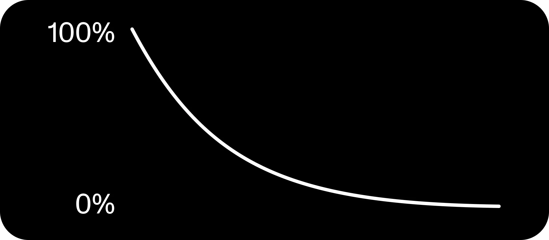
Retention curve flattens to zero
This retention chart means that users are less and less likely to return to your product over time. No matter how many new users are joining your platform now, without them coming back, you'll eventually reach zero active users.
In hindsight, you probably spent too much time and money acquiring new users before achieving product-market fit.
Meaningful growth requires both user acquisition and retention.
Retention is necessary, and it's quite hard to achieve. However, by strategically using cohort analysis, you can correlate retention with user behavior, giving you the information you need to make data-driven decisions.
From here on out, I'm assuming a basic level of experience with analytics platforms. Feel free to review this beginner's guide to Google Analytics if you need additional context.
How to perform cohort analysis?
Overview
Our ultimate goal is to be able to interpret retention charts and extract actionable insights to help inform the decision-making process. However, we must first understand how to generate retention charts.
The stage is set to review cohort analysis tools. Let's dive in.
For ease-of-access, I'll use a publicly available Google Analytics demo account. Click this link to access the data set. You'll be asked to sign in using your Google Account.
From the Google Analytics dashboard, choose the Audience tab (1) and then the Cohort Analysis tab (2). You should see the following screen:
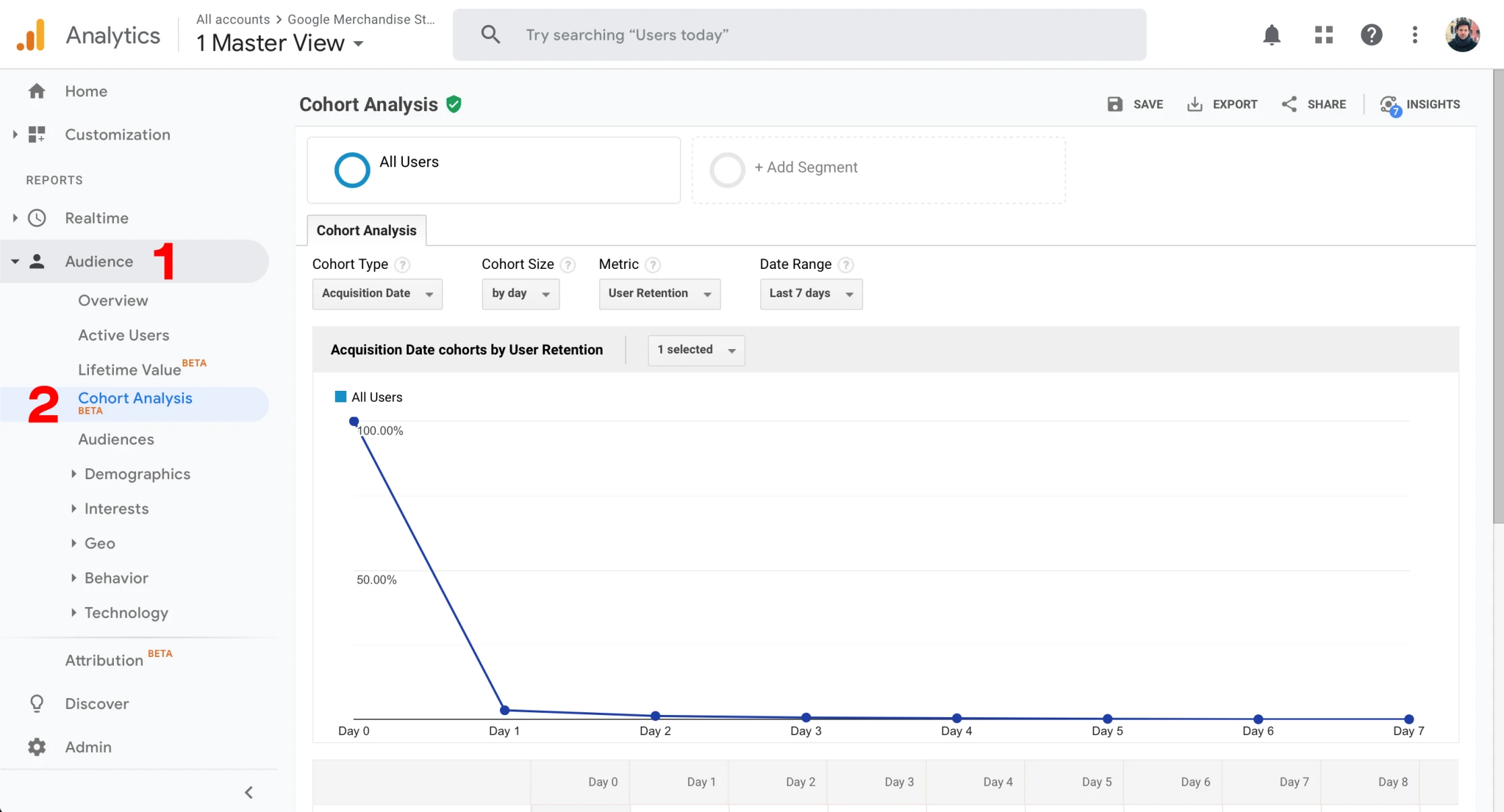
Navigate to the Cohort Analysis tab in Google Analytics
Filters
Let's first review the options available in Google Analytics for configuring the cohort analysis report. The good news is that although the UX might differ between analytics platforms (e.g., Google Analytics, Mixpanel, Looker), the functionality and terminology should be relatively close.
For the sake of brevity, I'm going to skip segmentation ("+ Add Segment" in the screenshot above). Using segmentation in cohort analysis is powerful and we plan on writing about it in the coming weeks. For now, I'd encourage you to read more about it here.
You'll see the following properties under the "Cohort Analysis" menu:
Cohort Type: set to User Acquisition. Google Analytics defines the User Acquisition Date as the "first time a user is recognized as interacting with your content." Consider it as the date of a user's first session.
Cohort Size: set to Day, Week, or Month. When choosing one of these options, let's choose Week. You're essentially asking to "create a cohort (a group of users) by the week they were acquired."
Metric: As mentioned earlier, Cohort Analysis can analyze different metrics. Perhaps you want to understand users' purchasing habits; you could select "Revenue Per User." For the sake of this article, we'll choose "Retention."
Date Range: Depending on the cohort size selected, this could be the number of days, weeks, or months to include, and it corresponds directly to the number of rows in the retention chart.
Retention Chart
Okay, I think we're ready to dive into the anatomy of a retention chart. Before going any further, let's make sure we have the same filter settings. Choose "by week" for cohort size and "last 9 weeks" for date range.
You should see this:
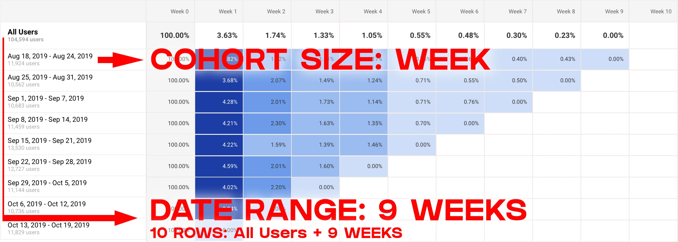
Cohort retention chart by week in Google Analytics
If you can't find the retention chart, scroll down, the retention chart is below the line graph.
You'll notice that a row represents each cohort. Each row is a set of users acquired during the same week. There are nine cohorts in total because we selected "Last 9-weeks" for our date range. If we had chosen "by month," each row would be represented by a month's worth of users instead of a week's worth.
There's also the first row at the top, entitled "All Users," which is the average of all cohorts below it.
Line Chart
Above the retention chart is a line chart. By default, the chart shows the cumulative metric values for all cohorts. Use the N selected menu to select a cumulative chart line and/or chart lines for individual cohorts. See here:
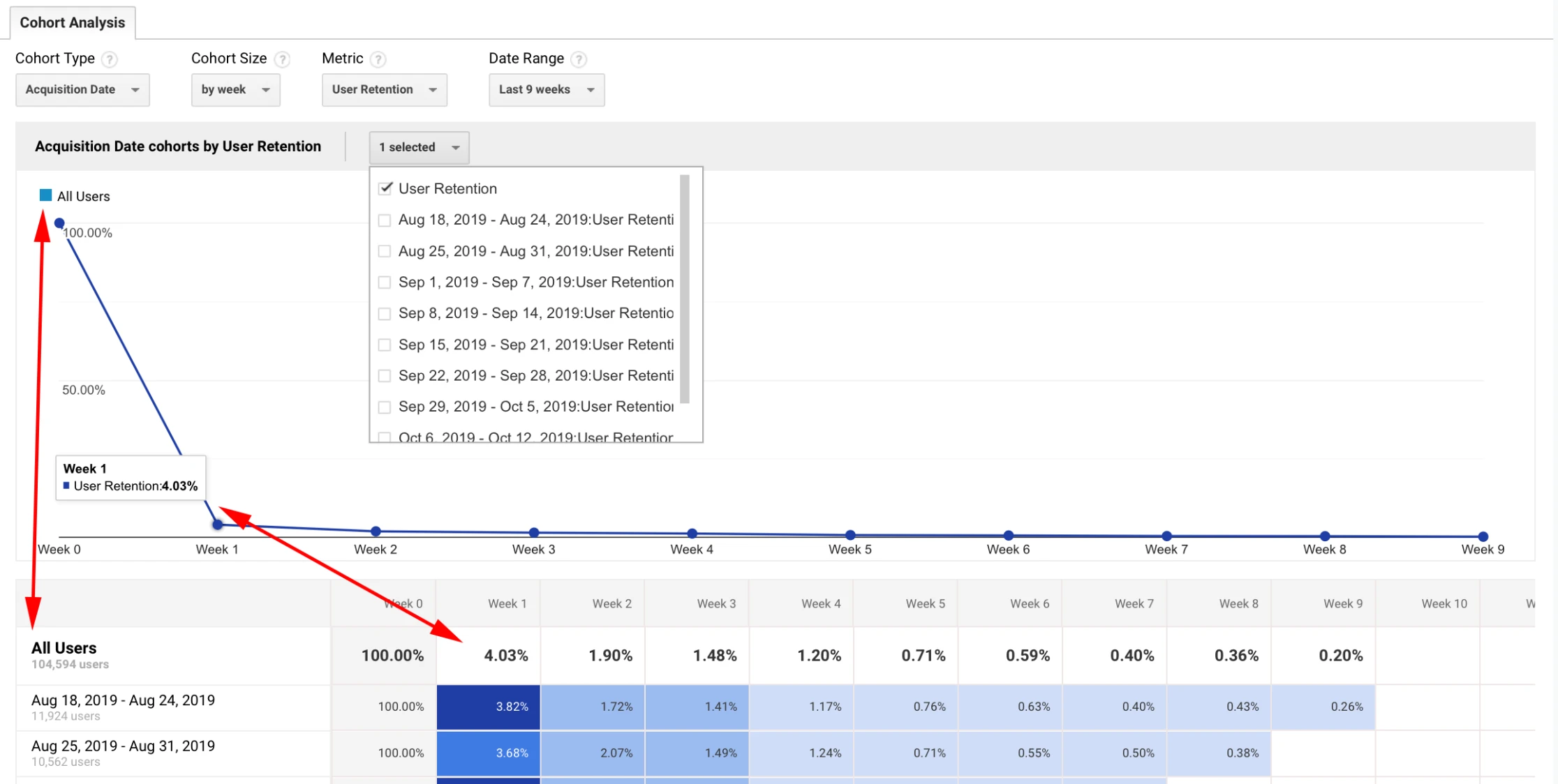
View your retention chart as a line chart in Google Analytics
You'll notice that the cumulative line chart plots All Users data points, which in this example, is the culmination of nine weeks of cohort data.
By changing the cohorts selected, see the N selected drop down ("1 selected") in the previous screenshot, you can change the data plotted in the line chart.
How to interpret cohort retention charts?
Yay, we finally made it.
So how should you interpret retention charts, and what does it mean for a cohort retention curve to flatten?
Well, let's first interpret the data in the previous chart. For all users acquired in the past nine weeks, only 4.03% returned during their second week. Ouch.
And even worse, by the fifth week, less than 1% returned. And if you follow the trend line, it's not too long until no one returns from these nine cohorts.
The goal is for users to return consistently, depicted in this graph, as a cohort retention curve flattens over time:
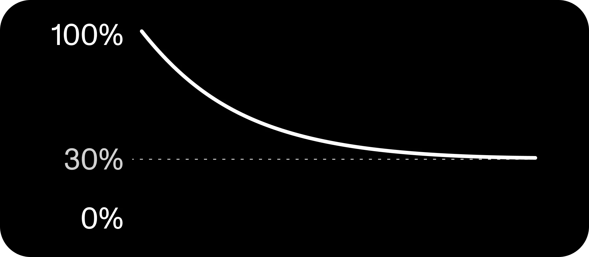
Cohort retention curve flattens to 30 percent
The cohort retention curve above tells an entirely different story. Roughly 30% of users are returning to your product over time. Meaning that if you didn't acquire any new users, you would still have existing users returning to your service.
An indication of achieving product-market fit. 👏
How can I use cohort analysis to improve my product?
First, understanding which cohorts tend to stick around longer is a significant first step. It will help inform your marketing strategy and ensure you're focusing on acquiring new users from your target market.
Second, by getting creative with a cohort analysis tool, you can begin to understand the point at which users drop-off. This information can help you identify two things:
Potential causes for attrition
Rate of user acquisition required to compensate for churn
Let's extend the SnapTok example from earlier in the article. You, the CEO of SnapTok, showed your retention chart to investors, and they had a mild panic attack. Nearly all of your users were expected to drop off within a few weeks.
However, let's pretend you decided to do a more thorough analysis, and it turns out the few users who stick around have something in common; they all follow ten or more users.
You now have enough information to form a hypothesis that users are more inclined to return if they follow ten or more accounts. Your theory is that by following a sufficient number of accounts, users' content feeds become more engaging and, therefore, sticky.
There are several solutions you could propose to increase retention. Here's three possible product improvements for getting new users to follow at least ten users in their first session:
Import contacts list to discover people from your personal network
Require new users to follow a minimum number of accounts during on-boarding
Improve discovery of content and content creators
Conclusion
Cohort analysis is a powerful tool to improve your understanding of engagement and retention. If you have a passionate group of users returning to your product or service, your retention curve will flatten over time. And if it doesn't flatten and approaches zero, you can use cohort analysis to dig deeper and gain insight into the user experience to determine what's working for returning users and what's not working for churned users.
--
Subscribe to Religion Studio's mailing list in our footer below for weekly goodness related to AI, emerging tech, strategy, design, product management, development, entrepreneurship, growth, and more!
✌️